Back to Blog
    Design

    Mobile-First Design: Why It Matters

    Sarah AhmedJan 12, 20254 min read
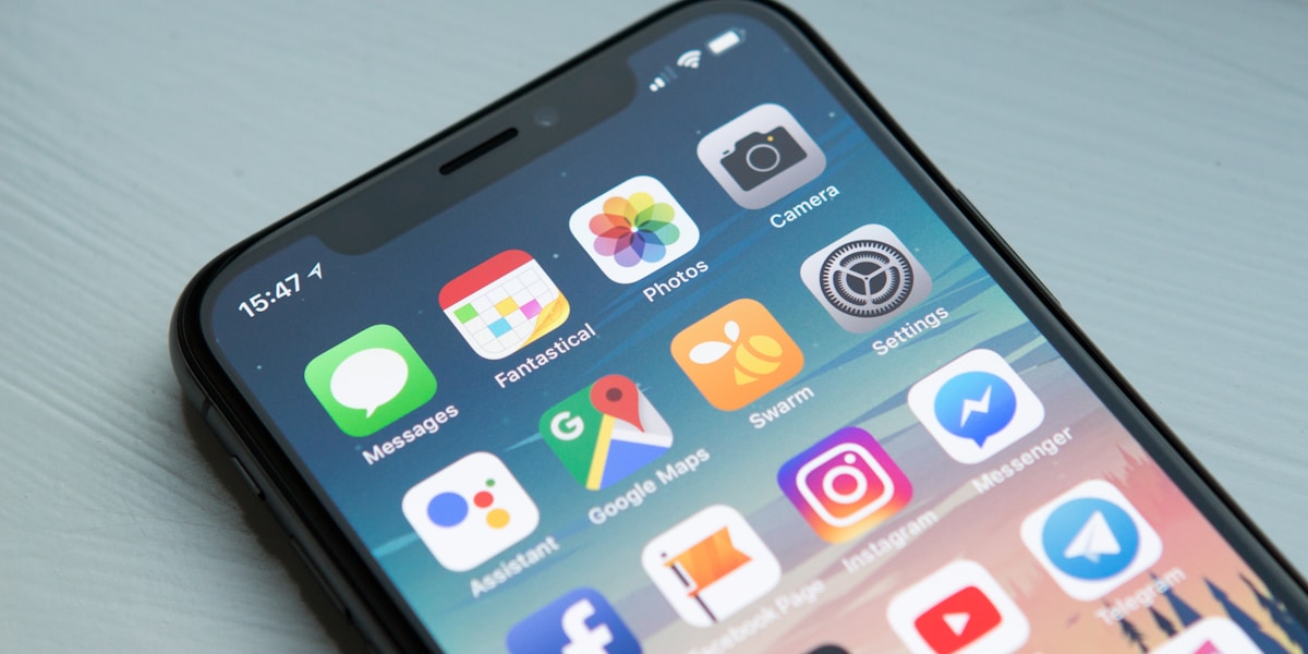
    Mobile-First Design: Why It Matters

    In today's digital landscape, more than 60% of web traffic comes from mobile devices. This makes mobile-first design not just a trend, but a necessity.

    What is Mobile-First Design? Mobile-first design is an approach where you design for the smallest screen first, then progressively enhance the experience for larger screens.

    Benefits of Mobile-First - Better Performance: Streamlined designs load faster on mobile networks - Improved SEO: Google uses mobile-first indexing - Higher Engagement: Users stay longer on well-optimized mobile sites - Wider Reach: Accessible to users in regions where mobile is the primary device

    Key Principles 1. Content Priority: Focus on essential content first 2. Touch-Friendly: Design for finger taps, not mouse clicks 3. Progressive Enhancement: Add complexity for larger screens 4. Performance Budget: Set strict limits on page weight

    Implementation Tips Start with a single-column layout, use relative units, implement lazy loading, and test on real devices throughout development.

    Share this article:
    Chat with us